CPPCC member challenges one-size-fits-all urban policy requiring unification of Chinese store signs

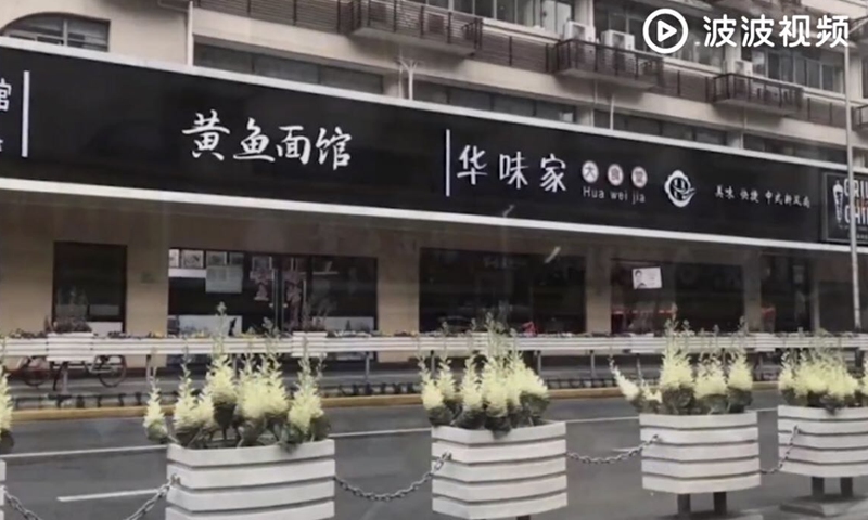
Street signs on Changde road in Shanghai Photo: screenshot of video posted on Sina Weibo
As China's 2021 two sessions approach, many proposals about public issues are being prepared by members of the top political advisory body, including one that challenges government policy unifying store signs.
According to Chinese media outlet The Paper, Lin Yang, former chief editor of Chinese Fine Art Publishing House and a member of the Chinese People's Political Consultative Conference (CPPCC), plans to submit the proposal at the two sessions. The proposal suggests that local governments respect the laws of art and aesthetic needs, and set up an art group to guide the construction of cities.
The impetus for Lin's proposal is a controversial policy implemented by local governments that requires the owners of stores along streets to all use the same-color and same-typeface for their signs to "beautify the city's appearance."
In some places, store owners have even been requested to use white characters on black backgrounds, a requirement that has been mocked by Chinese netizens as making these places of business seem like funeral parlors.
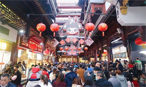
"I often see a whole line of the same store signs along a street and cannot tell what each store sells. These billboards make me lose interest in going inside these stores as they are really boring and ugly," a Wuhan resident surnamed Fen told the Global Times on Monday.
"It is said that this policy was implemented to be selected as a 'Chinese Civilized City,' which has uniformity as one criteria," the report said.
Lin noted that the criteria to be a Chinese Civilized City requires that a city's urban planning be reasonable and allow residents to enjoy a harmonious and beautiful environment, which itself isn't a problem, except that some local authorities have decided to adopt a one-size-fits-all approach to achieving it.
The deputy recommended replacing the boring typeface on these unified streets signs with Chinese calligraphy to highlight Chinese culture. "It is easier to create a unique logo using Chinese calligraphy, even more than using English letters."
"The various functions of urban architecture make it impossible to unify the appearance of a city," Max Liang, an architect based in Chengdu, Southwest China's Sichuan Province, told the Global Times.
Liang compared a city to a box preserving people's collective memory. There are dilapidated buildings and new modern buildings, so making them uniform would without a doubt erase some memories.
The designer also put forward a suggestion aimed at improving Chinese commercial signs by allowing them to add color to cities and truly making their appearances beautiful.
Liang said that these signs should be created in accordance to a brand's feature and what visual effects it wants to convey to consumers, and meanwhile, the city's features should also be taken into consideration.
For example, modern elements including neon tubes are used in coffee and dessert shops' signs in Chengdu, while some teahouses and mahjong houses often choose to use wooden signs sporting Chinese calligraphy.


